


An Extraordinary Line
From W.H. Robinson to Peter Max

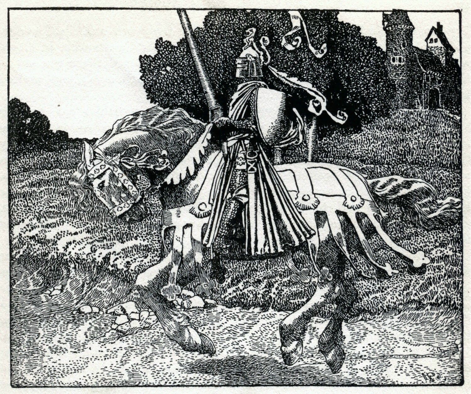
As a pen & ink artist I usually prefer a highly-textured style, using many different ink marks for varied effects. One of my “inking idols” is Howard Pyle (1853-1911). His draughtsmanship was steady and consistent, indeed masterful. Here is an example of Pyle’s work from 1903.
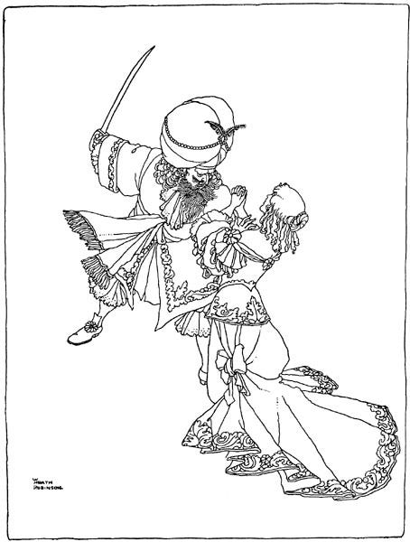
At the other end of the spectrum we see an inking style using very few lines but in which each mark is used to maximum effect. In this week’s ROCKETEER we’ll take a look at this second style of inking. You may recognize it from the pop art style of the 1960’s and ‘70’s. Personally, I grew up around Peter Max artwork so I’ve been familiar with the style for my entire life.
Let’s take a look at some examples.
Golden Age of Children’s Book Illustration
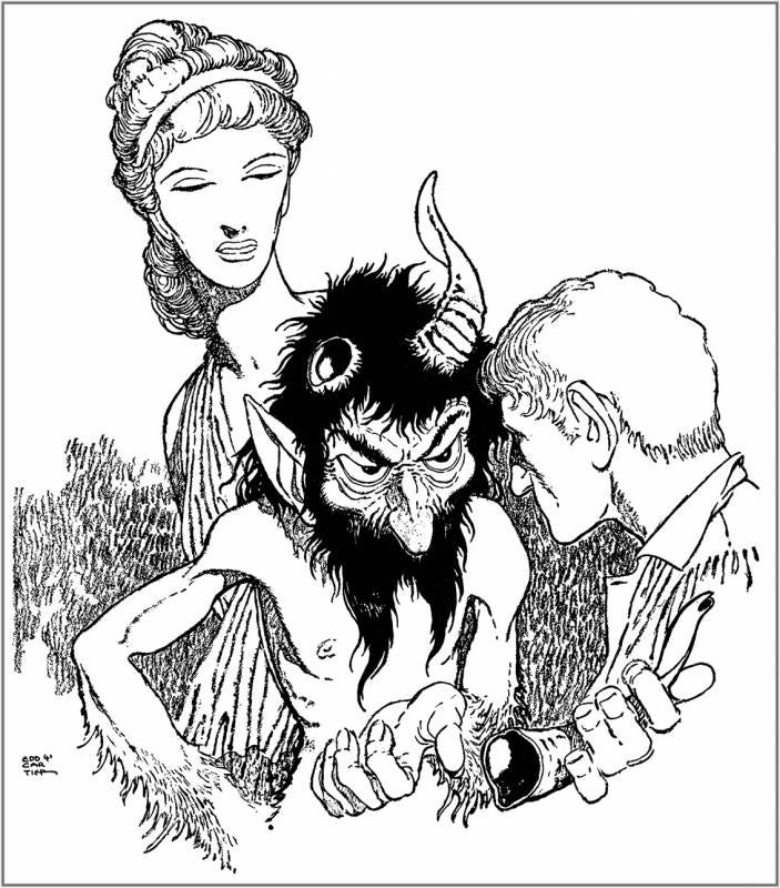
Pulp Era Magazine Illustration
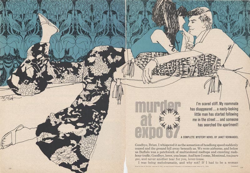
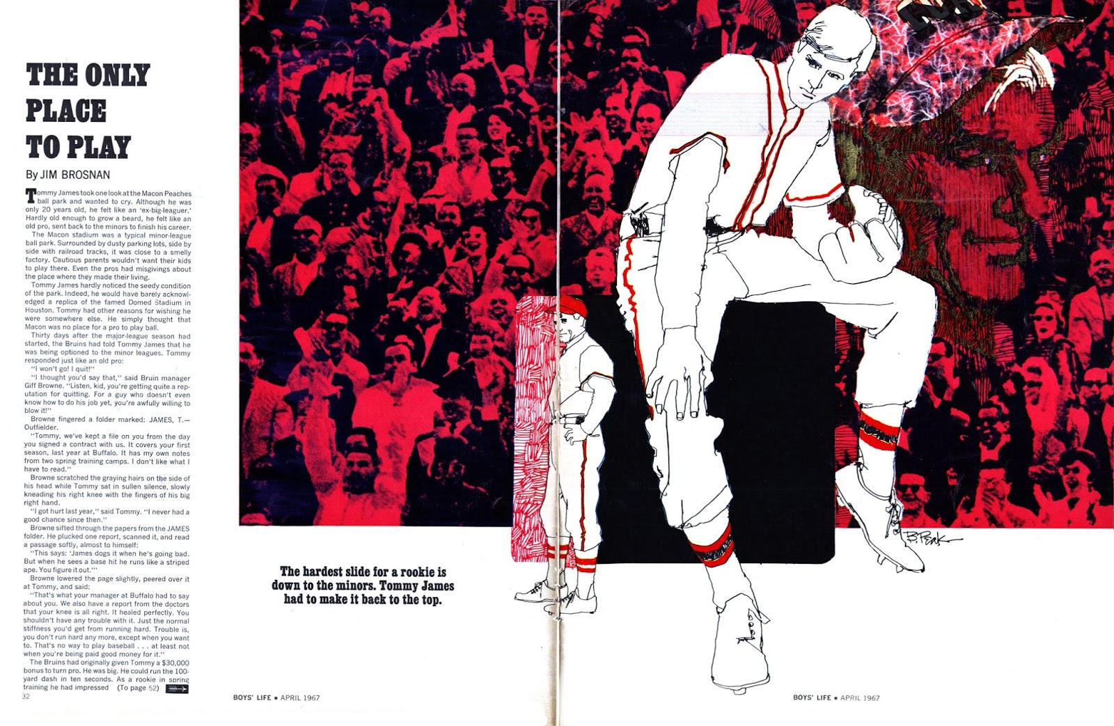
Print Magazine Illustrations
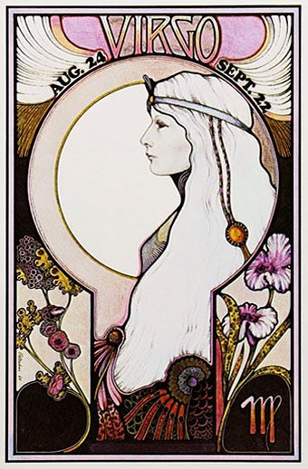
Poster
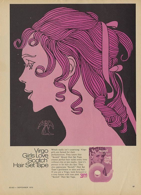
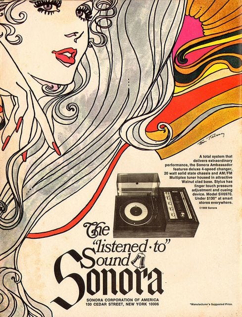
Advertisements
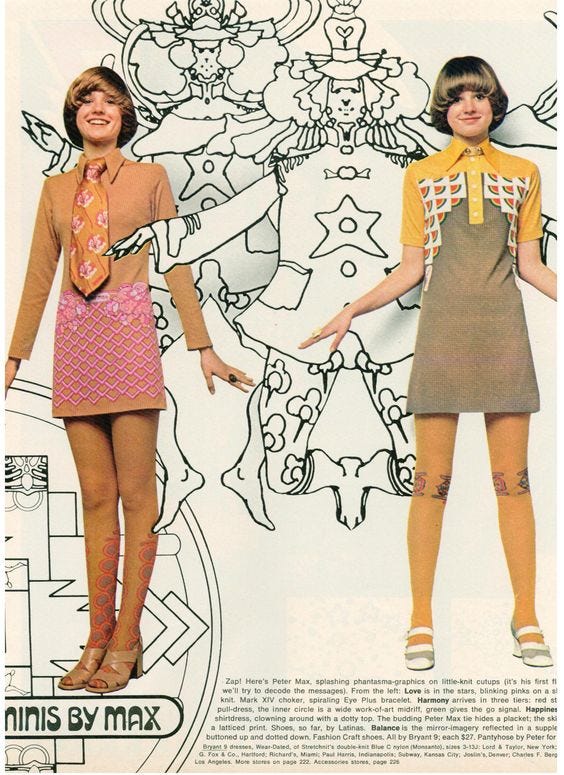
Look at the ink lines in these illustrations. Often there is little to nothing in the way of shading and color is added in large, flat blocks. Facial features such as eyelashes and lips are highly-stylized. Hair is simply done using either contour lines or blocky shapes.
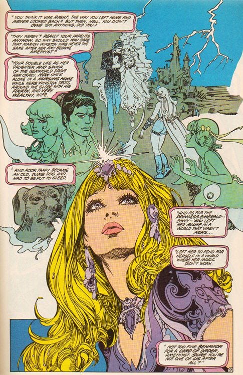
Comics
You might think that all comic inking is done in this manner but it is not. Generally, Western comics do not use expressive and graceful lines. This is not to say they are badly drawn, just that the linework is utilitarian and in service to the design. But here is an exception, Esteban Maroto’s comic work.
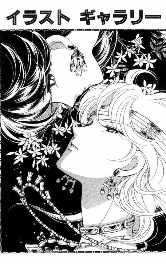
There is something very feminine, very Art Nouveau, about this style of inking. You do see it in Japanese manga (comics) which often uses expressive and graceful lines as in the example below.
Which inking style do you prefer, the highly-complex or the more simple and graceful? Drop in a comment below and let me know.
This is the Rocketeer signing off for today.