

In this episode of The Rocketeer Podcast, I analyze pulp magazine art through the lens of classical composition. Drawing from Renaissance structure, the Golden Ratio, and commercial illustration theory from Andrew Loomis, I discuss how composition guides good illustration.
What is composition in art?
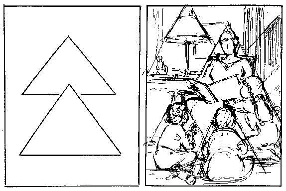
What makes one pulp cover feel stable and powerful while another feels wonky? The answer often lies not in the subject, but in the structure beneath it.
This week I’m looking at composition in art—how classical armatures, including geometry and musical ratios, quietly guide the viewer’s eye. I’ll be sketching a line directly from Renaissance principles through 20th-century commercial illustration. I’ll touch on Pablo Picasso and Andrew Loomis as we explore the structure beneath the paint and ink.
Why do some pulp covers feel strong and others weak?
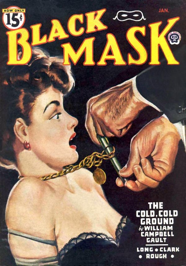
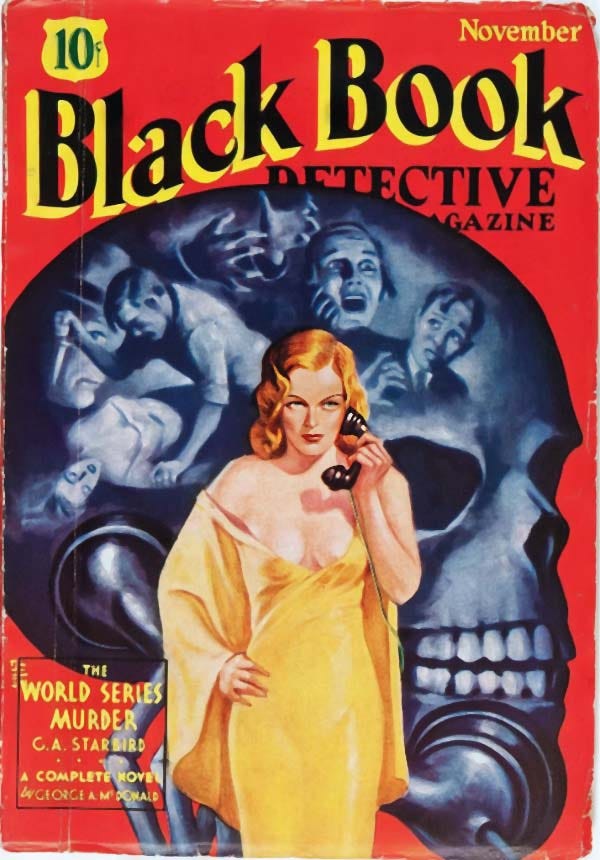
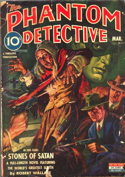
Using the four selected samples below—three structurally strong and one awkward—I invite you to look beyond the category label of “detective art” and see instead how composition shapes emotional response. This isn’t about judgment. It’s about learning to notice what your eye already senses—and understanding why it matters.
Take a look for yourself
Look for the structure beneath the art. Once you see it, you cannot unsee it. And that changes everything.