


Soldiers and Sports Stars
Wartime Propaganda

This is the Rockeeter and today I have a question for you, Space Explorers—do you like propaganda?
If that seems a funny question than perhaps you just don’t realize just how soaked in propaganda we’ve been for the last century. Longer, really, but it’s fully provable back to the early decades of the 20th century.
In 2024 we’re awash in news of various sorts, and all of it is trying to convince us to believe, do, or buy something. Those who don’t have marketing degrees (and I suspect many people who do have then) may not realize just how much the clickbait we are regularly served has changed us. We are more skeptical than ever and really tired of having these obnoxious ads shoved under our noses.
Good ads may be clever, funny, intelligent, effective, and impressive. But most marketing ads and/or campaigns today just feel yucky. And most people don’t understand how to market in a way that intrigues potential clients instead of turning them off. Personally, I dump hundreds of ads from my email accounts daily without even glancing at more than the title line. And I know I’m not alone in this.
So what does this have to do with the pulps? Sure they had ads in them like any magazine, but that’s not what I want to talk about. Back in WWII there was a very strong thread of “friendly” propaganda in the United States. This came from our own government and was focused on the getting people engaged with the “war effort,” as it was called. The war effort was heavily promoted as something that everyone should participate in, one way of the other. Most people know about this and it really doesn’t bear too much discussion. Almost everyone has seen the famous “Rosie the Riveter, We Can Do It” poster. Nowadays, it’s often used a symbol of female solidarity, which was it’s original purpose, as well, although for different reasons. In those days they were encouraging women to take on some typically male jobs in order to continue war production at the factories.
The pulps played their part in the war effort, too, of course. Publishers regularly trotted out all manner sorts of war stories, articles, and promotions for war bonds. Wartime pulp covers were also a thing, and you can find tried and true Americana covers across all sorts of genres from general fiction to sports. Interestingly, the pulp color palette shifted a bit as the 1940’s progressed, sometimes emphasizing “army green”—which is a type of yellow green—much more heavily than they ever did in previous decades. This was a subtle reminder of the war and that everyone was in it together.
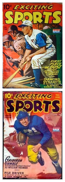
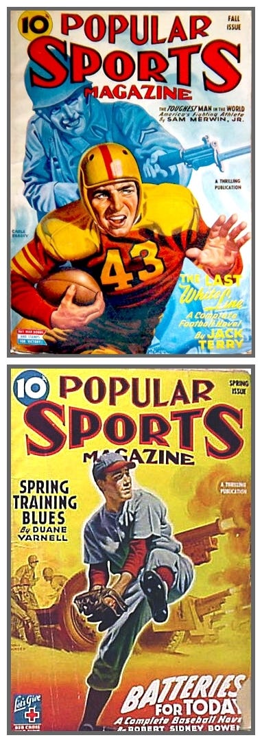
Pulp publishers, trying to stay relevant for their readers, had other ways of promoting the heroic war-time spirit, too. This had to do with American ideals. These ideals, while less odious than much of the propaganda we see today, were nonetheless promoted as something to aspire to. Young men were heroes, whether on the sports field or the battlefield. Young women were beautiful and faithful beacons for which the young men could strive. These sorts of stereotypes were everywhere during the 1940’s. However, one of the oddest places I’ve seen them were on a series of sports pulp covers put out by Ned Pines’ Standard Magazines between 1943 and 1946. What made these covers so interesting and unique were their dual themes on the same cover. Young men were imagined as both sports heroes and brave warriors, both dreams of the American male. The imagery they used to show this theme remains effective to this day.
Now before anyone gets ruffled, indeed all the images I’ve posted with this article show Caucasian young men. On magazines covers like this you would not see anything but the imagined “All American” hero. Other ethnicities would be shown as wartime antagonists only and African Americans would not be shown at all. Good or bad, that’s just the way it was. So leaving philosophical arguments about ethnic diversity aside for the moment, let us consider these thematic covers and why they were so successful and are remembered so fondly by collectors today.
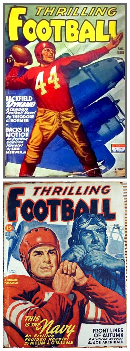
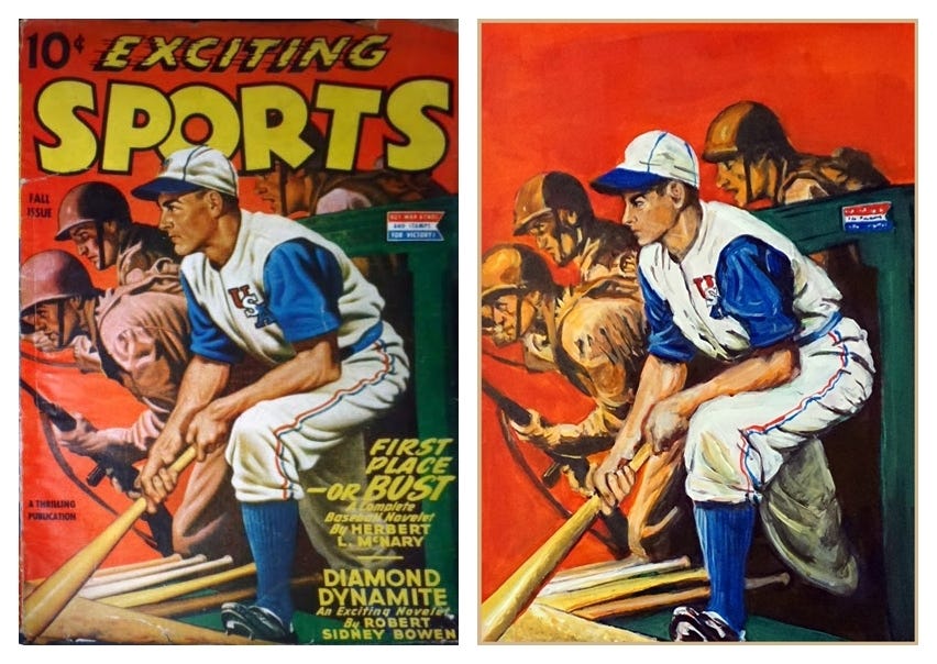
These eight sports pulp covers were published in a range from 1943-1946 by Ned Pines, the publisher of the “Thrilling Group” of pulp magazines. Pines’ magazines were put out under several different company names— Standard Magazines, Nedor Publishing, Better Publications, Thrilling Publications, and Beacon Publications. During this particular period of 1943–55 they were under the Standard Magazines banner. There were two specialty covers in this series for each of four magazines: Exciting Sports, Popular Sports, Popular Football, and Thrilling Football. There were four additional covers seen on Thrilling Sports which fall under the same general war-theme but not in the actual group to my thinking. But more on those later.
All of these well-executed cover paintings, except for one, were painted by popular cover artist, Earle K. Bergey. You might know his work from his pin-ups as well as his science fiction pulp covers. The other cover in this series was painted by Rudolph Belarski, another pulp cover pro. All eight covers follow a similar theme—the All-American high-school sports hero dreaming of becoming a war hero. He plans to join the war effort and go overseas to fight the Axis. In the “now” of the moment he is painted in full color, while in the daydream he is shown in monochrome, which has the effect of throwing that part of the picture to the back of the composition. This is a highly effective technique and it was seen in other pulp magazine covers as well such as the detective hero pulp, Black Mask. However, on those covers the technique was used for different reasons.
As you can see, these are visually complex covers, all well-drawn and painted. In each one the athlete is comparing his sport to some type of war scene which include bombers, tanks, artillery fire, and various scenes of charging into battle. He is imagining the scene and we are right there with him. I own one of these issues and it does include several war stories but nothing to exactly fit the cover illustration. This makes me pretty sure that the covers were merely a lure for the magazine itself. (And this was often the case for pulp covers, in general, anyway.)
For folks who not used to looking at a variety of pulp covers you will note that there are no nearly-naked girls on these. Most of the pulps, even when they do show girls in less than complete dress, usually do not emphasize the smutty aspects. For those types of pulps you’d have to look to the self-titled, “Spicy” pulps as well as some pulp paperbacks.
So these appealing sports covers targeted a very specific demographic and I think they did a swell job of it. Now, don’t get me wrong. I am not pro-propaganda. But I am a sucker for a good illustration and these are excellent in several categories. The images are well rendered and painted. The compositions are top-notch. And the messages are, if a bit pointed, still extremely effective. They may be propaganda but they are “nice” propaganda.
They are so effective, in fact, that I plan to resurrect the basic idea for a couple of my own book covers. As a first step towards this goal I chose to make a copy of one of these wartime sports covers. I picked out a complex one as my subject, the Fall 1944 cover of Exciting Sports. I decided on acrylics as my medium and used a large, half-sheet of cold press watercolor board for a surface. (This is 22” x 30” for you non-painters out there). Almost immediately I realized that I was painting the young man a little differently from the way that Bergey had. It wasn’t a mistake, my young man just seems younger and does not seem as eager for war. This is my artist’s soul speaking, I think. The dream of war doesn’t really work for me, personally, and that seems to have been translated into my painting’s hero. Otherwise, I think it’s a pretty good copy. I liked it so much, in fact, that I’ve framed it. It’s the only pulp copy I’ve made that I have framed.
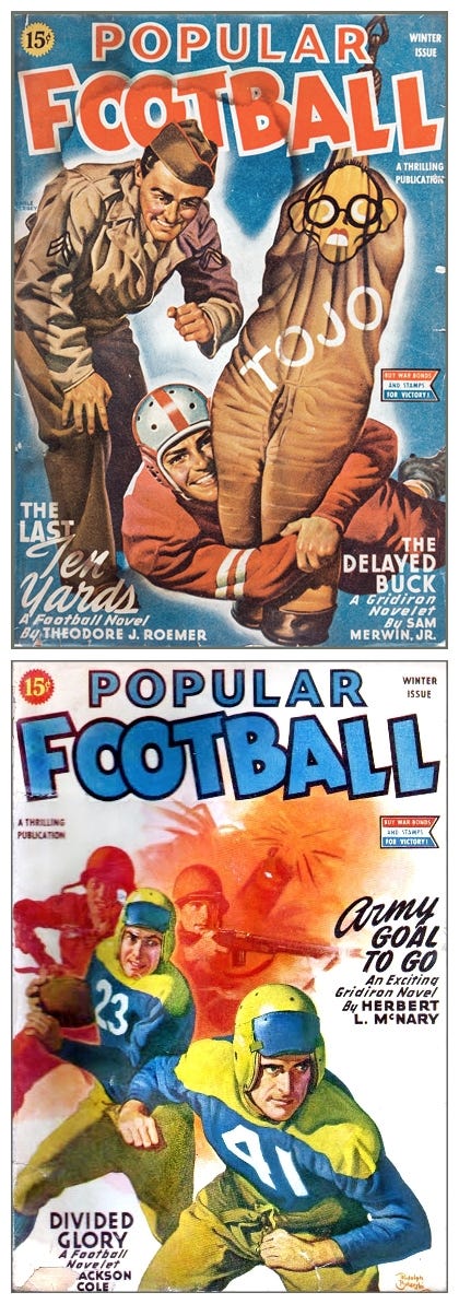
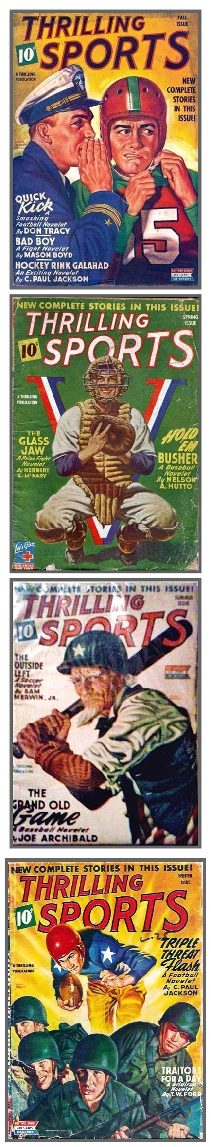
As I mentioned before, there were other wartime sports covers put out by the same publisher at the same time, but none of them are really part of the above group. They don’t share the same visual intention as the others. I have added a few of these just below, so you can judge for yourself.
I was reading a social media post on an art group the other day and noted that one the commenters was complaining that “painting is dead.” Bushwa, I say! As long as there are artists painting, it’s not dead. Perhaps they meant that fine art painting is dead. Or maybe they were referring to commercial art perhaps. But pulp art painting really IS dead. Except for a very few artists, no one remembers how to paint in this style. Even less of those who are making new pulp art can paint anything like the old painters without digital tools. I had to train myself to turn away from hyper-realism (which I’m very good at, by the way) and learn how to paint with broad brush strokes like they did back then. I had to learn the color palettes and the types of compositions. I had to forget some of the accepted current illustration adages and just throw in with painting people from behind or three quarters behind, for example. And I had to learn about melodrama in visual storytelling! There is no pulp artwork without melodrama. And you know what? It’s really fun to paint that way! I love it. I’ve gotten to the point now where I am beginning to create new pulp compositions along the lines of the old work. There are no magazines who would want to use them though, as they might have decades ago. So at this point I’ll use my new/old pulp art style for my own books while continuing to learn how to tell visual stories as good as these wartime magazine covers.
This is the Rocketeer signing off for today.
Awesome!
And FUNNY. Some.
Pretty sure Adam Hughes borrowed some poses from this pulp style for his Man of Steel and Superman covers. And Captain America... Trying to think of his art with males rather than his popularity for females...
John Bolton borrowed some great poses as well. Classic!
Thanks for the BERGEY installment.