


Virgil Finlay and the Art of Scratchboard

Scratchboard used to be a common illustrative technique. Back in the 1930’s, it was often seen in fine art and illustration work. It printed well and, if used to the fullest effect, seemed almost magical. It’s use has dropped off today and scratchboard now is seen rarely in illustrations or fine art.
I learned the technique back in the late 1980’s, while in graduate school for scientific illustration. In those days, it seemed a generally dying art form although it was still relied upon for several categories of scientific illustration such as floral and faunal designs. One of the reasons for its decline was the rise of digital illustration. Today, it’s pretty easy to simulate scratchboard art digitally. Also, one of its primary purposes is no longer valid—to create a piece of art which photographs well for printing. The entire printing process has changed so dramatically as to be unrecognizable from earlier decades.
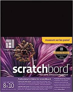
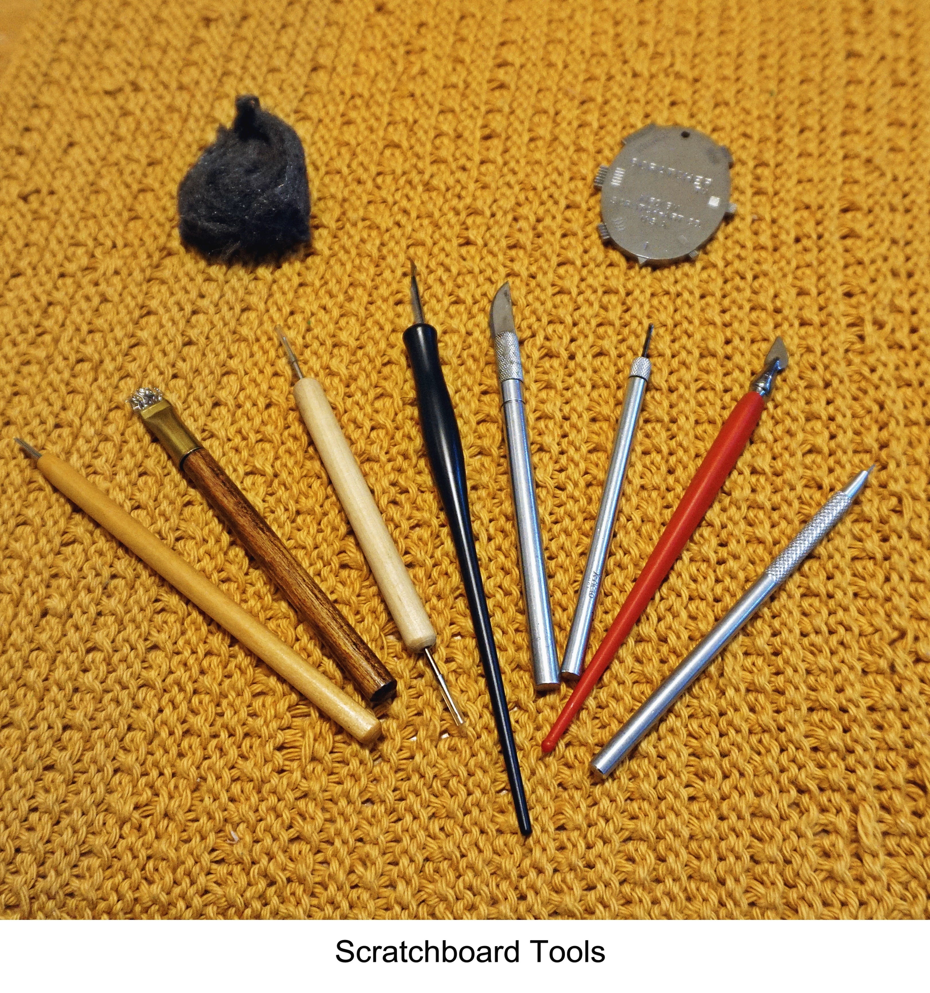
The basics of the technique are as follows. Traditional scratchboard (or Scraperboard in the U.K.) is a an art board coated with a specially-prepared clay surface. Today, you’ll find it produced by Ampersand in the U.S. and Esdee in the U.K. It starts out as a white surface, although it can be bought already covered by black ink. If you have a white board, you will apply smooth coats of a black ink (such as India ink) to the areas that will be primarily black in your design. The areas which will be primarily white, you’ll leave alone and apply black ink using traditional pen and ink techniques. For the black areas you’ll create linework by scratching through the inked surface to the white beneath through the use of styli, art knives and other specialty tools. Corrections are made by reapplying black ink.
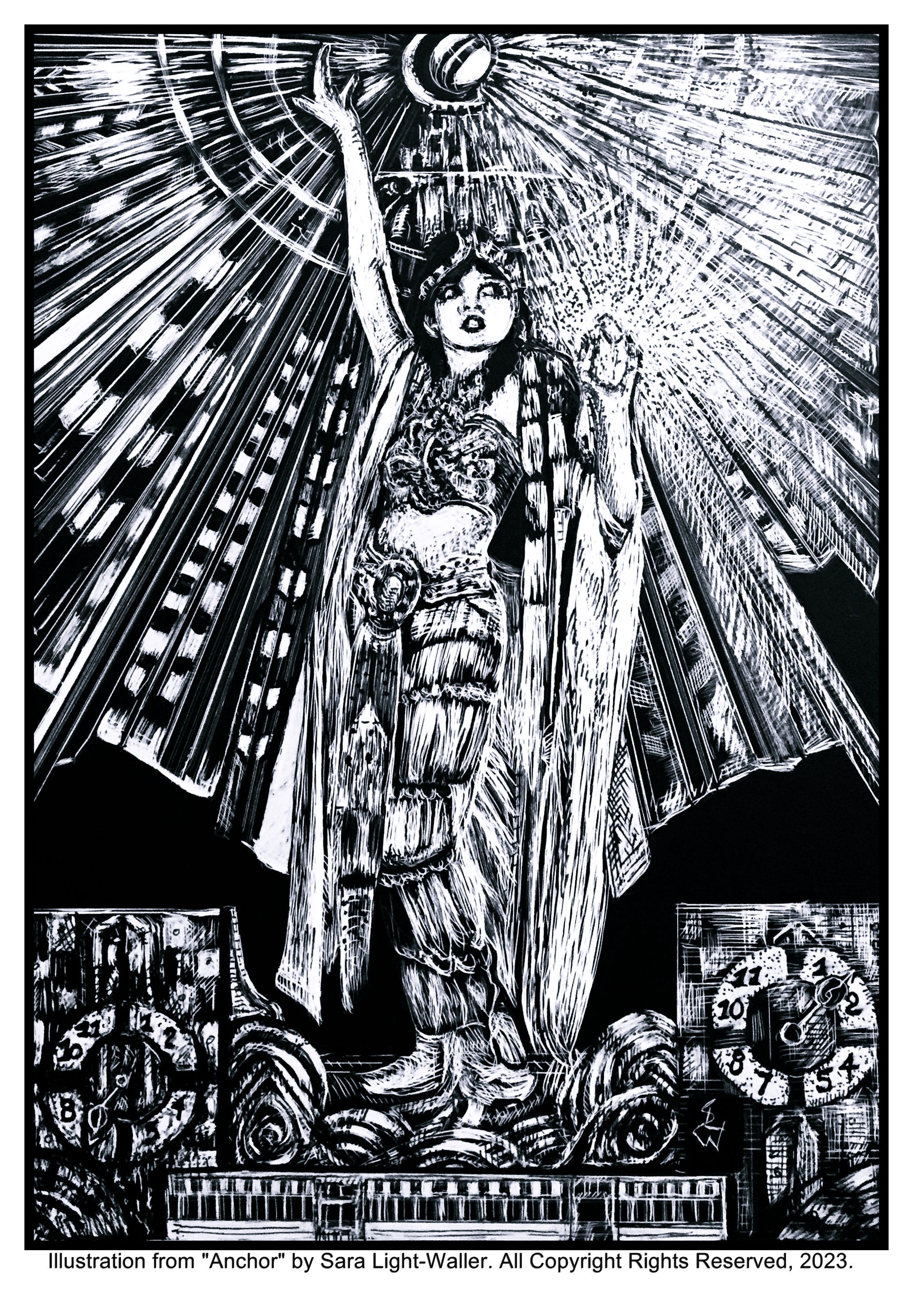
I find it an enjoyable technique and have created many pieces using scratchboard. The header illustration for this post is an illustration from my pulp story, Anchor: A Strange Tale of Time.
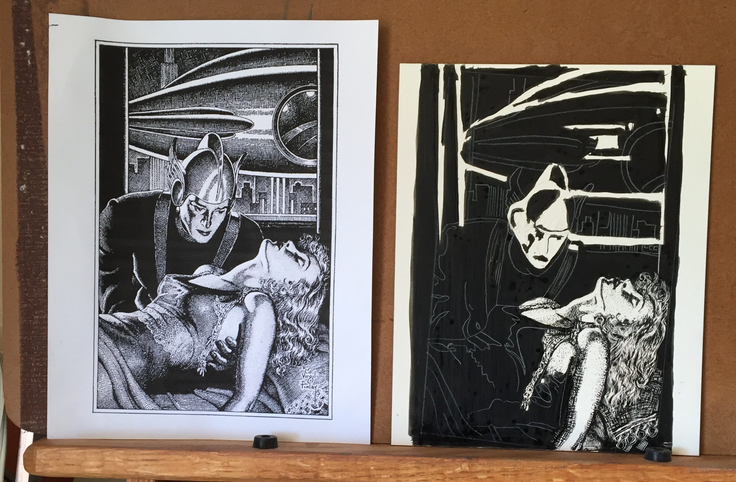
Virgil Finlay (1914-1971) is recognized as one of the best science fiction illustrators of the pulp era. His eye-catching designs and allegorical subject matter are unique within the genre. Anyone familiar with pulp magazines, especially science fiction pulps, will know of Finlay’s art. He was incredibly prolific and produced hundreds of magazine and book illustrations during his relatively short lifetime. He also worked in pen & ink, and in color.
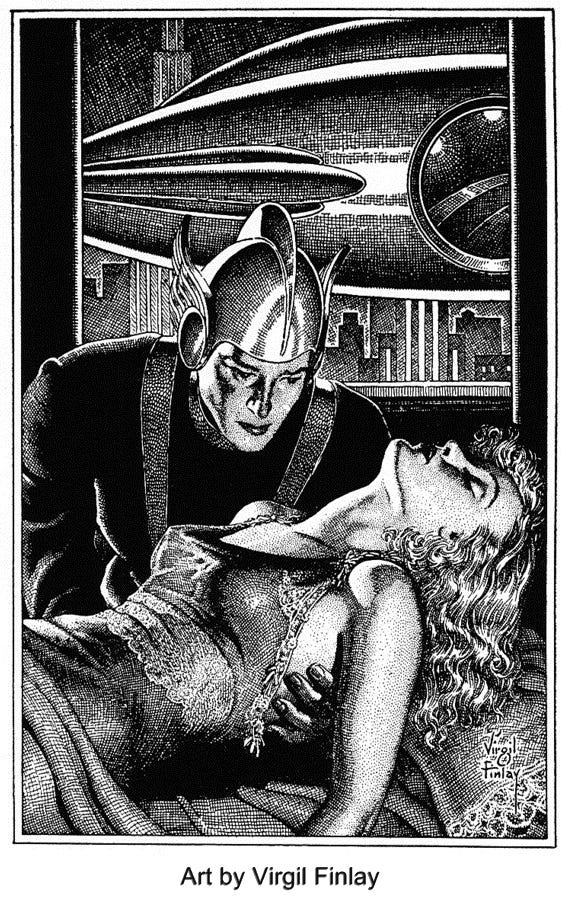
Pen and ink drawings create the illusion of tone (grey scale values) through the use of lines, dots, and solid areas of white and black. Individual ink marks are important and artists use a wide variety of them to keep their work lively. Finlay typically used two types of ink or scratch marks for shading—cross-hatch and stippling. His meticulous work reflects Machine Age design, there’s not an ounce of quirky deviation to it and this includes his figures which are exquisitely rendered.
As a student of pulp illustrations and techniques I was curious about his process and wanted to recreate one of his pieces as part of my on-going mission to become a better pulp artist. I chose a romantic science fiction subject, a space hero rescuing a girl.
Copying a Finlay piece wasn’t a simple undertaking. it quickly became clear to me that he worked a scratchboard using both additive and subtractive ink marks. This means that he’d scratch an area then add additional ink marks to enhance it using a pen. He worked very fast which is astounding considering the high level of detail. I wondered what sort of pens he’d used, how much of his pieces were subtractive, how much additive, and so on.
I chose 9” x 12” Ampersand Claybord for my surface and used an assortment of nibs and pens including a dip pen with a fine crow quill nib, several ink brushes, Micron pens, and a variety of scratchboard knives and tools for the subtractive parts.
Here are a few pictures of my process.

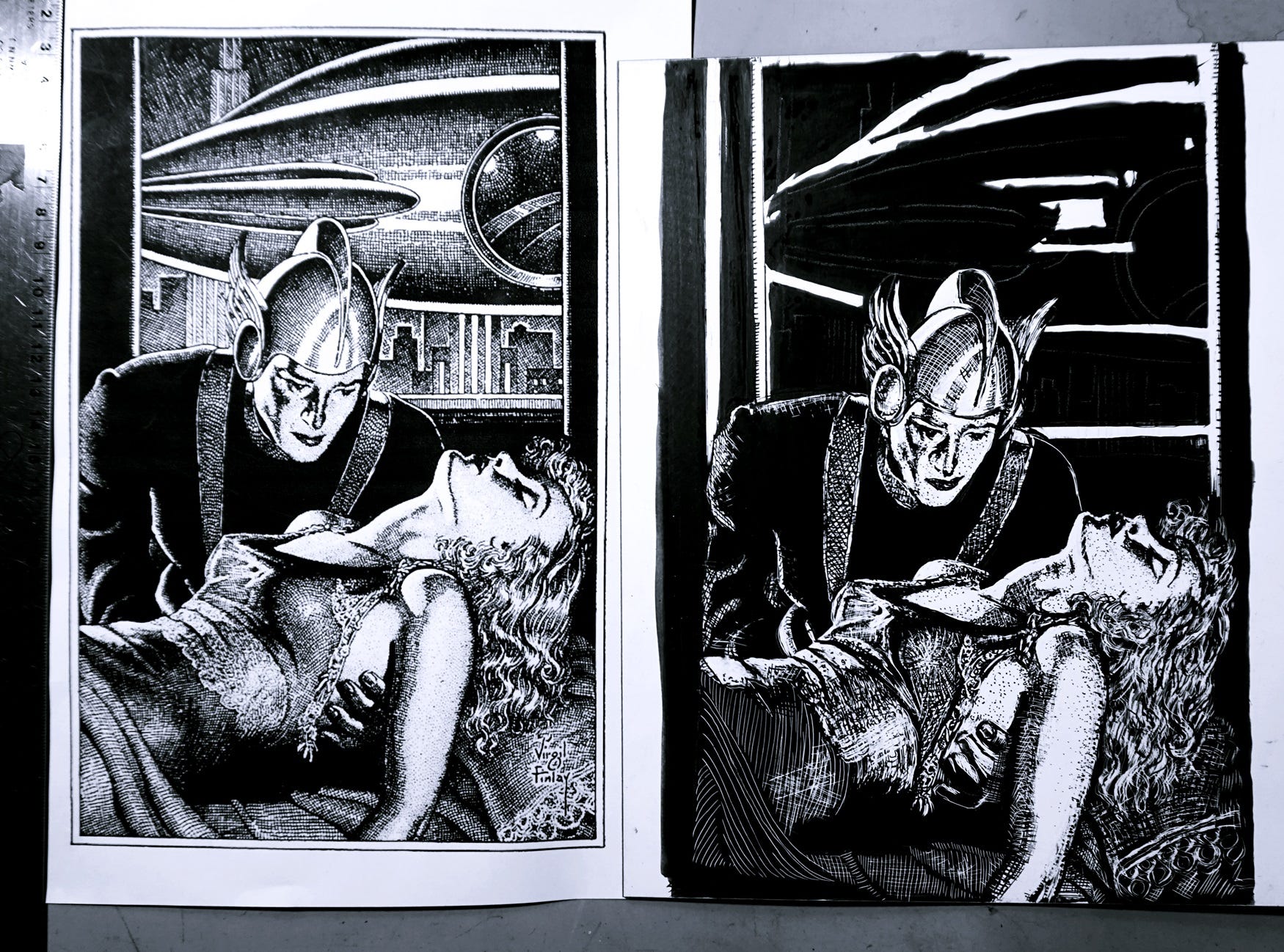
Ultimately, I got close to the mark with my copy but not close enough for my liking. I made some initial drawing errors which cost me dearly in the end, especially in the man’s face. As a final measure I did a more accurate pen & ink rendering of the man on Bristol Plate using a Namiki Falcon fountain pen with a fine/medium nib. The nib seemed just about the right size for Finlay’s precise marks and this makes sense as it is similar to the size of a crow quill nib, a common nib size used at the time.
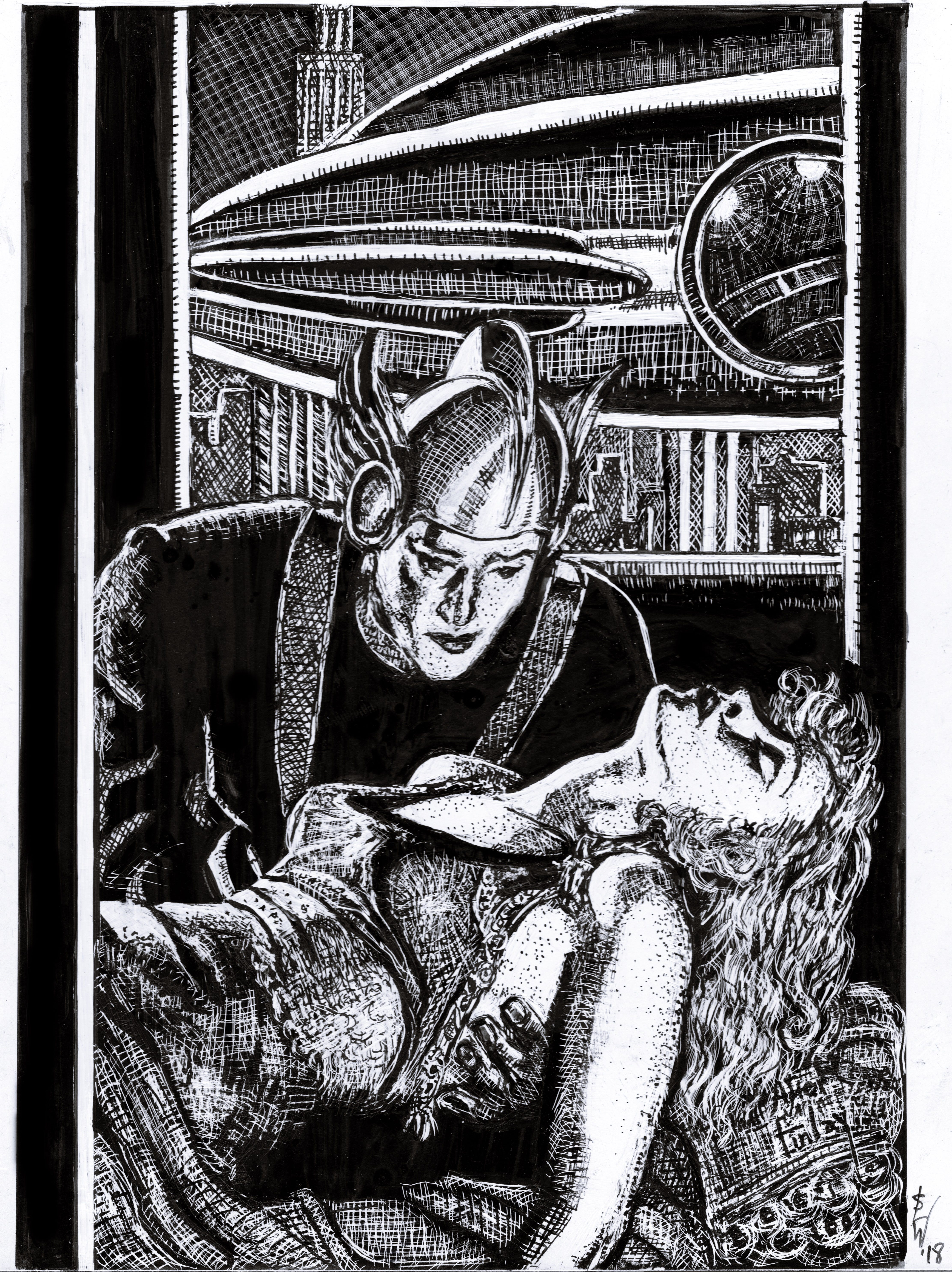
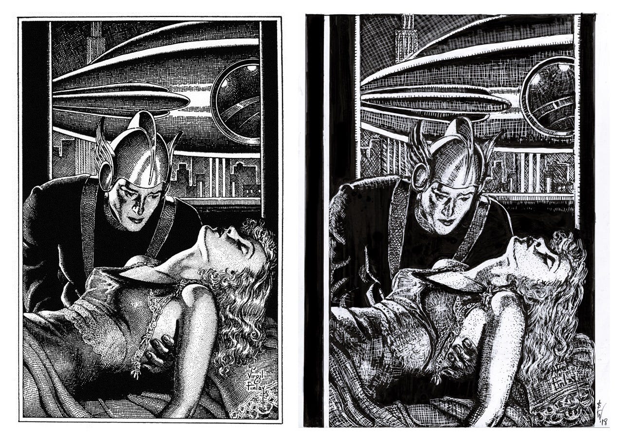
Above you see the finished copy in entire and below, the pen and ink copy of the man.
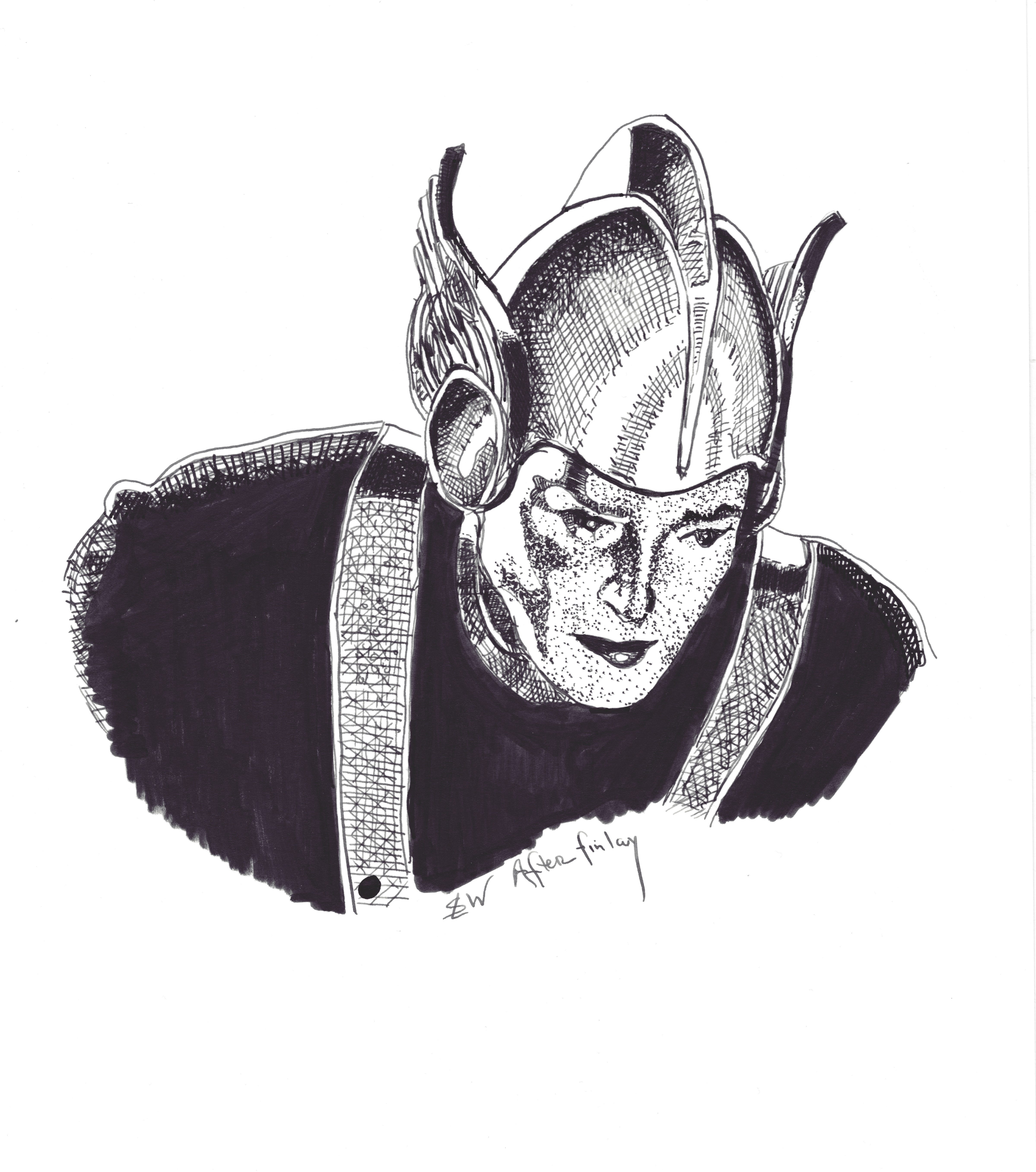
I enjoyed making this copy. Finlay’s marks are solid but as not diverse as some artists I have copied before. He was a skilled technician, his use of light and shadow was excellent, as was his sense of texture. His limited repertoire of ink marks could partially explain how he worked so quickly. I know from other sources that he worked 1:1, the same size that the image would be ultimately printed. This is highly unusual for pen & ink artwork which is typically produced at least 25% larger than the image will be seen in print. Working 1:1 might also account for his high level of precision as he couldn’t rely on reduction to make the artwork look tightly-rendered.
From this artist’s perspective, Virgil Finlay’s work remains worthy of admiration.
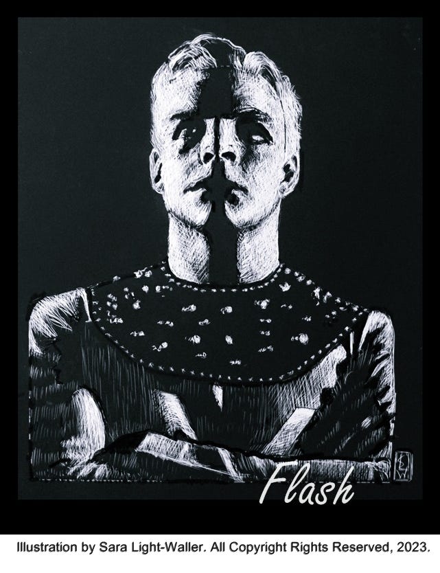
As a final note, here is a more recent scratchboard piece of mine—a picture of Buster’s Crabbe’s “Flash Gordon.” Scratchboard art continues to be one of my favorite techniques, along with pen and ink.
This is the Rocketeer signing off for today.
I've been very surprised recently to discover -- via seeing Finlay originals online -- that some of his work I always assumed to be on white/uninked scratchboard was created on plain papers using pen with WHITE ink.