

Westerns in Space
Or, space operas r us

I once did an interview with a popular contemporary writer known for her space operas. In the interest of bringing readers up to speed I asked her a commonly accepted question—“some people consider space operas to be westerns in space. What do you think of that?” Her answer was a slightly haughty, “of course they are, everyone knows that.”
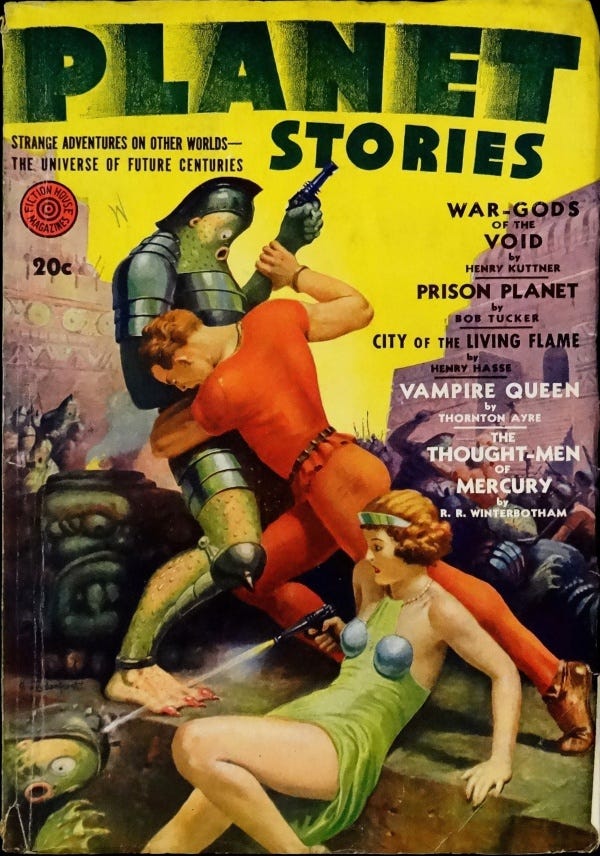
As I said, it was a question only meant to get readers up to speed with the author’s works. And it is true, traditional space operas do fit that story pattern. But there’s a hitch. I’ve observed that modern book art for space operas don’t seem to follow that idea all the way through anymore. And no, I’m not talking about horses flying in space (although we do see horses with anti-gravity tech in the “Buck Rogers” strips back in 1929.) What I mean is taking the drama seen on Western pulp art magazine covers and transmuting it into space art.
The reason this is coming up for me as that I’m currently planning a book cover for a pulpy space opera which is also a romance. I’ve been noodling around with book cover ideas and it suddenly occurred to me that if I took a concept from a specific type of western pulp cover it might well serve as the basis for my space opera cover.
But not just any cover would do. Here are my self-imposed rules for the art.
1. Era. The model cover would have to come from the 1930’s, probably from one of the western romance titles such as Rangeland Romances. The reason for this is that in the 1920’s and particularly in the 1930’s, the girl is often seen helping the hero out in some way as an equal. She might be breaking him out of jail, or firing his gun while he’s injured, or even guarding him in some way. She’s a real helpmate and it seems very impressive, especially considering the domestic role women take on the western romance covers ten years later. And my heroine is no fainting flower, she’s as much as a fighter as the hero is.

2. No horses. I don’t mind turning a horse into a flying contraption but in this case, it’s not needed.
3. Gear & Guns. Pistols are pretty easily translated from westerns into space opera blasters, all you need is to add some Art Deco flanges and other ray guns touches. But clothing is another matter. I decided that the haberdashery should be consistent with what is seen on the covers of a handful of Spicy Adventure magazines from the early 1940’s. Artist, H. J. Ward showed us some great “standard” space gear. If you give a character too much of a wardrobe, they’re hard to redraw repeatedly. Of course, in this case, the characters don’t have much clothing on but for other reasons. lol My characters will be fully dressed but the feeling of their outfits will be similar.
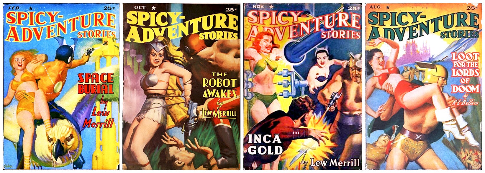
4. Color palette. This is as, of yet, undecided in my mind. It could go two ways—low key and dark, or high key and bright. The scene I have in mind takes place in the interior of a massive alien church, so low key and muted might work. Of course, the characters would be bright and eye-catching anyway, something like the Spicy Adventure cover second from the left above.
5. Romance. This is Book One of a four book series so the romance must be present but not too swept away. (I’ll save that for Book 2.)
As a pulp artist of the old school I strive to bring forth works of art which suit the story and immediately make you think—“pulp art.” My goal for this book cover, as always, is to create a work of art which both suits the story and helps set the stage for a pulpy adventure. Fingers crossed and brushes ready!
This is the Rocketeer signing off for today.